
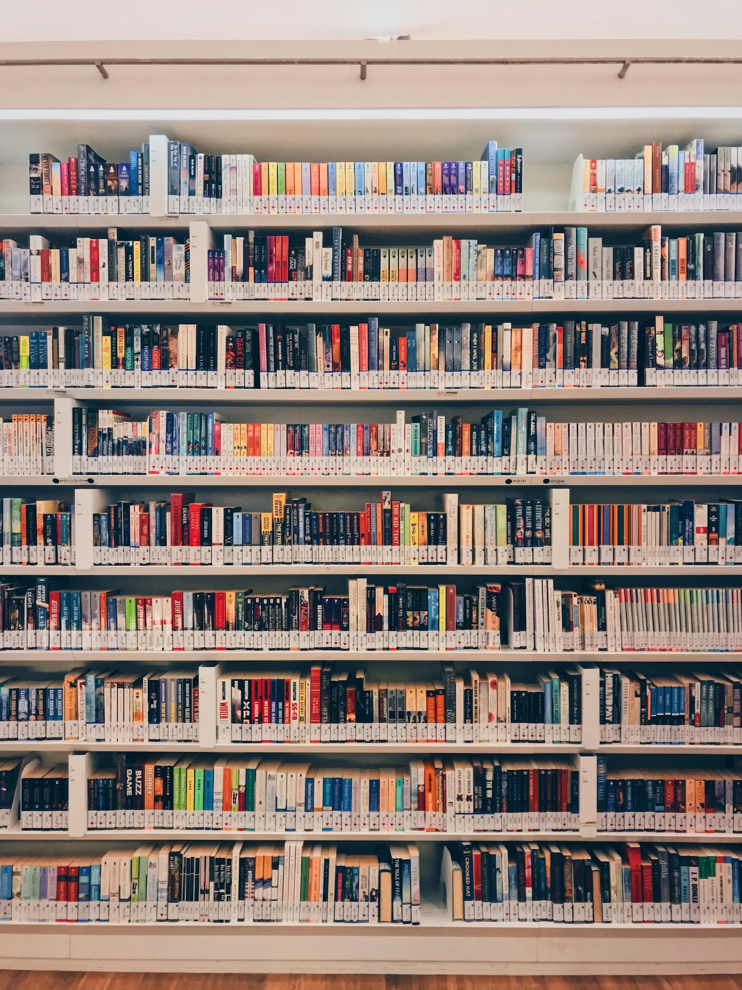
You delete another button. Then another headline. Suddenly your homepage looks… empty. Not elegant. Empty.
Minimalist design has a funny way of exposing every weak decision. When there’s nowhere for bad typography, cluttered layouts, or decorative flourishes to hide, one thing suddenly matters a whole lot more: the imagery.
A single photograph can make a minimalist design feel sophisticated, or make it feel like someone forgot to finish the page. That’s the beauty of simplicity. It’s also the challenge.
Minimalism Isn’t About Having Less, It’s About Saying More
People often describe minimalism as “clean.” Fair enough. But clean isn’t the goal. Clear is.
Every element left on the page has a job to do, and that includes your images. Without layers of graphics competing for attention, photography becomes the emotional heartbeat of the design. One compelling image can establish trust, create atmosphere, and communicate your message before visitors read a single sentence.
That’s a lot of responsibility for one picture. Choose wisely.


When One Image Carries the Whole Conversation
Imagine walking into an art gallery. White walls. Plenty of space. One painting hanging in the center.
Now imagine replacing that painting with a blurry smartphone snapshot. Exactly.
Minimalist layouts work the same way. White space naturally directs attention toward whatever remains, which means every photograph becomes a focal point instead of background decoration.
Whether you’re designing a blog, portfolio, online store, or landing page, impactful imagery immediately answers questions visitors don’t even realize they’re asking.
Can I trust this brand?
Does this feel professional?
Should I keep scrolling?
The right photo quietly says yes.
Forget Generic Stock Photos
We’ve all seen them. The suspiciously happy coworkers pointing at invisible charts. The awkward handshake. The businesswoman laughing alone with a salad.
Those images don’t just look dated, they interrupt credibility.
Modern audiences recognize authenticity almost instantly, and they appreciate it just as quickly. Genuine expressions, natural lighting, real environments, and candid moments create emotional connections that polished clichés simply can’t match.
According to the Nielsen Norman Group, relevant, meaningful imagery improves user understanding and engagement, while decorative or unrelated stock photography often has the opposite effect.
That’s worth remembering before downloading the first smiling office photo you see.
White Space Is Doing Half the Work
Here’s the part people underestimate. Minimalism isn’t empty space waiting to be filled. It’s active space directing attention.
Large margins, generous padding, and uncluttered backgrounds allow photography to breathe. Instead of competing with overlapping graphics, shadows, or decorative icons, the image commands attention naturally. It’s almost unfair how effective this is.
One striking visual surrounded by breathing room often feels more premium than an entire page packed with design effects.
Choose Images That Let Simplicity Shine
Not every beautiful photo belongs in a minimalist design.
Some images are simply too busy. Crowded streets, cluttered desks, or noisy backgrounds can overwhelm an otherwise clean layout. Instead, look for visuals with:
– Clear focal points
– Plenty of negative space
– Natural lighting
– Balanced compositions
– Cohesive color palettes
– Authentic subjects
These characteristics help images integrate naturally into minimalist designs rather than competing against them.
If you’re searching for high-quality free stock images, platforms like Pinqic make it easier to find visuals that support clean, modern aesthetics without sacrificing personality.
Color Still Speaks, Even When You Use Less
Minimalist doesn’t mean monochrome. In fact, one carefully chosen splash of color often has greater impact than an entire rainbow scattered across a page.
A warm sunset. A bold yellow jacket. Deep green foliage.
Because everything else remains restrained, those colors naturally become visual anchors. Adobe’s design resources consistently highlight visual consistency as a key ingredient for strong branding and memorable user experiences. It’s another reminder that restraint isn’t boring. It’s strategic.
Authenticity Ages Better Than Trends
Design trends come and go. Remember glossy buttons? Massive drop shadows? Everything looking like frosted glass? Some trends deserve retirement.
Authentic photography doesn’t have that problem.
Real people, natural environments, honest moments, they continue to feel relevant because they’re built on human connection instead of temporary aesthetics. That’s especially valuable for brands trying to build trust over time rather than chase whatever happens to be popular this month.
Minimalism Works Almost Everywhere
The beauty of impactful imagery is that it scales across industries. Whether you’re creating:
– Personal portfolios
– Editorial websites
– SaaS landing pages
– Online stores
– Travel blogs
– Lifestyle magazines
– Marketing campaigns
– Creative presentations
…strong visuals elevate simple layouts without adding unnecessary complexity.
Sometimes the smartest design decision isn’t adding something new. It’s removing everything that distracts from what already matters.
Final Thoughts
Minimalist design asks every element to earn its place. That’s exactly why imagery matters so much.
One carefully selected photograph can establish mood, communicate professionalism, guide attention, and create emotional connection in just a few seconds. When paired with generous white space and thoughtful typography, impactful visuals transform simple layouts into memorable experiences.
The goal isn’t to decorate the page. It’s to give visitors something worth looking at.
Leave a Reply